ThinkTime empowers retailers with intuitive task and communication tools designed to enhance performance across every store and engage every team member.
Retail
Industry
2024
Project Year
Project Software
Figma
At ThinkTime, our enterprise-level retail operations software serves a wide range of users — from store managers on the front lines to regional leadership and corporate admins. Over time, the product had become cluttered, unintuitive, and visually outdated. The goal of this project was to modernize the user interface and dramatically improve the user experience: fewer clicks, more clarity, smarter workflows, and better scalability for future feature development.
Objective and Goals
The primary objective of this project is to revamp the mobile app interface by addressing outdated UX patterns and enhancing the overall user experience. This involves a comprehensive reassessment of current design elements to simplify user interactions, enabling seamless navigation and task completion.To achieve this, the project will focus on three key goals:
1. Modernize the Visual Interface: Update the design across all modules with a modern aesthetic while maintaining consistency. Leverage existing design components where appropriate to ensure coherence and streamline future implementation.
2. Understand and Support Product Value: Identify the most valuable features and functionalities for users. Design scalable and reusable components that support long-term growth and evolving user needs.
3. Simplify User Flows: Reduce complexity by eliminating unnecessary steps and minimizing friction points. Implement targeted design improvements to enhance efficiency, increase user productivity, and boost overall satisfaction.
Role
I was the sole UX Designer on this redesign project. Initially, I collaborated with another designer, but after she went on maternity leave, I took full ownership of the design function — from brainstorming and creating visual concepts to prototyping and collaborating with developers to ensure successful implementation.
I worked closely with:
• Product Owners: to define priorities and scope for each release
• Developers: to ensure feasibility and alignment between design and implementation
• Client Success Managers: to gather indirect user feedback
• VP of Product: for high-level strategy and design approvals
Due to the absence of integrated tracking and formal user testing tools, direct research was limited. Instead, we relied on insights from client-facing team members who regularly train users and gather informal feedback. Their close interactions with clients helped us understand key value areas and highlight opportunities for improvement.
We also reviewed client builds directly, which gave us a better understanding of usage patterns, preferred features, and pain points. This approach allowed us to make informed design decisions and better align the user experience with client needs.

User Frustration
Indirect workflows contribute to user frustration and dissatisfaction. This led to decreased engagement and potential churn.
Under-utilized Features
Clients are not fully leveraging the product's capabilities and in some cases turning to other companies to solve for this need. There is opportunity to increase engagement, and thereby retention.

Visual Design Improvements
Modernizing the app's visual appearance to align with the redesigned web experience and current design trends is imperative to staying competitive.
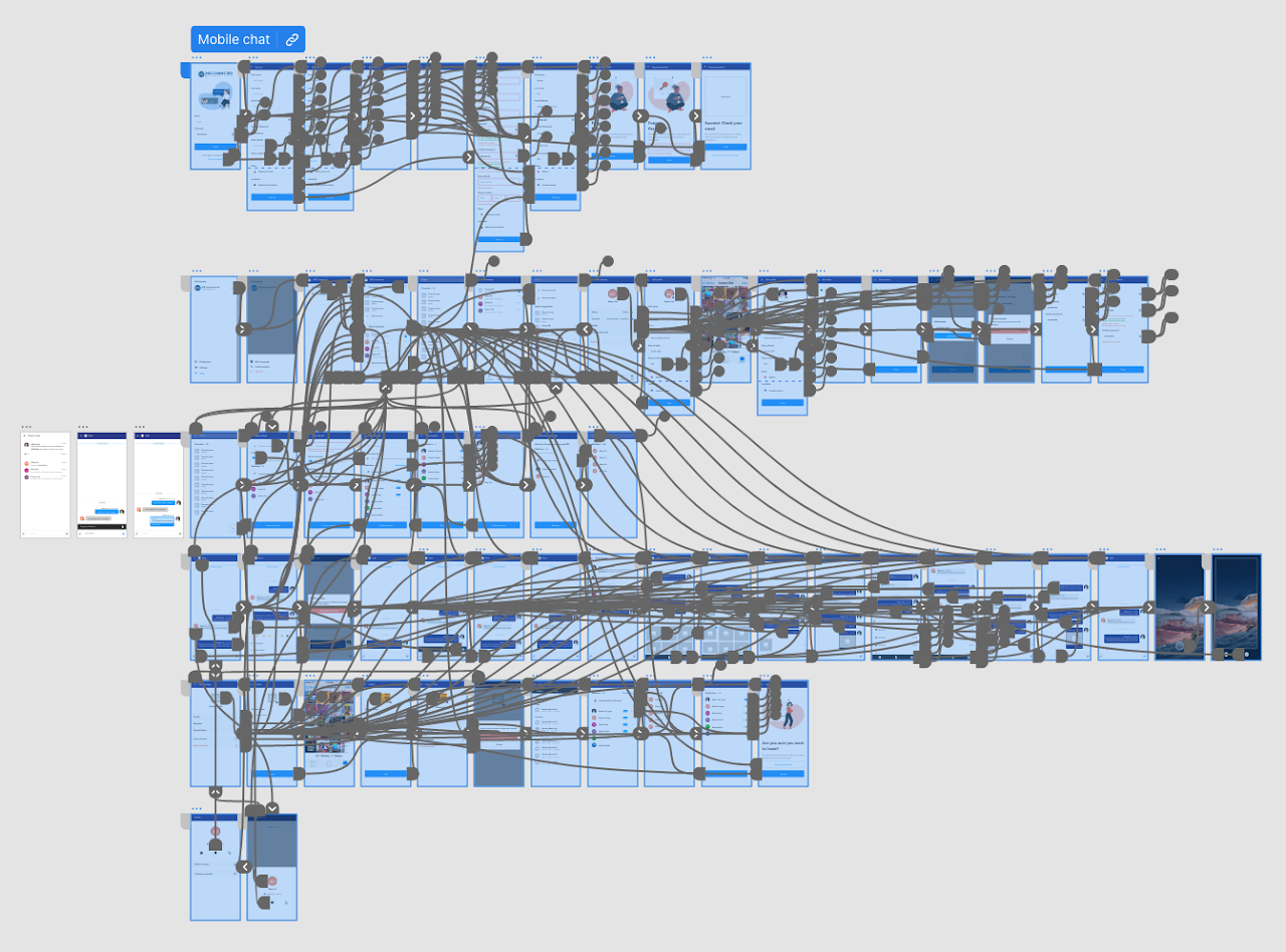
Our design process was highly iterative and collaborative. We worked closely with product owners and the product director to align on business goals, user needs, and feature priorities. Each redesign cycle began with a product brief, followed by a UX audit, wireframing in Figma using our design system, prototyping key flows when necessary, and collaborating with developers via Jira to ensure smooth handoff and implementation.
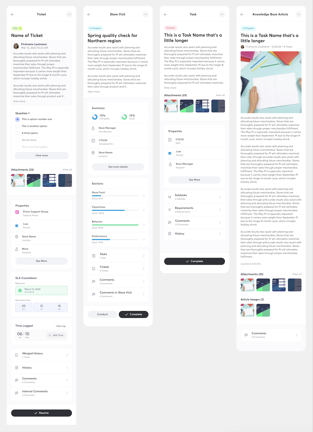
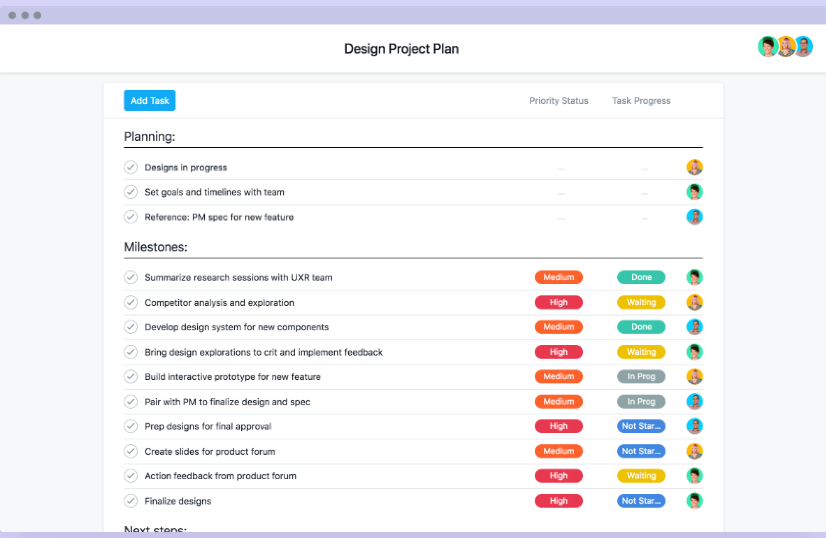
Over the course of the year, I led the redesign of several major modules—including Use By Date, Store Visit, Tickets, and the kickoff for Tasks—across both web and mobile platforms.
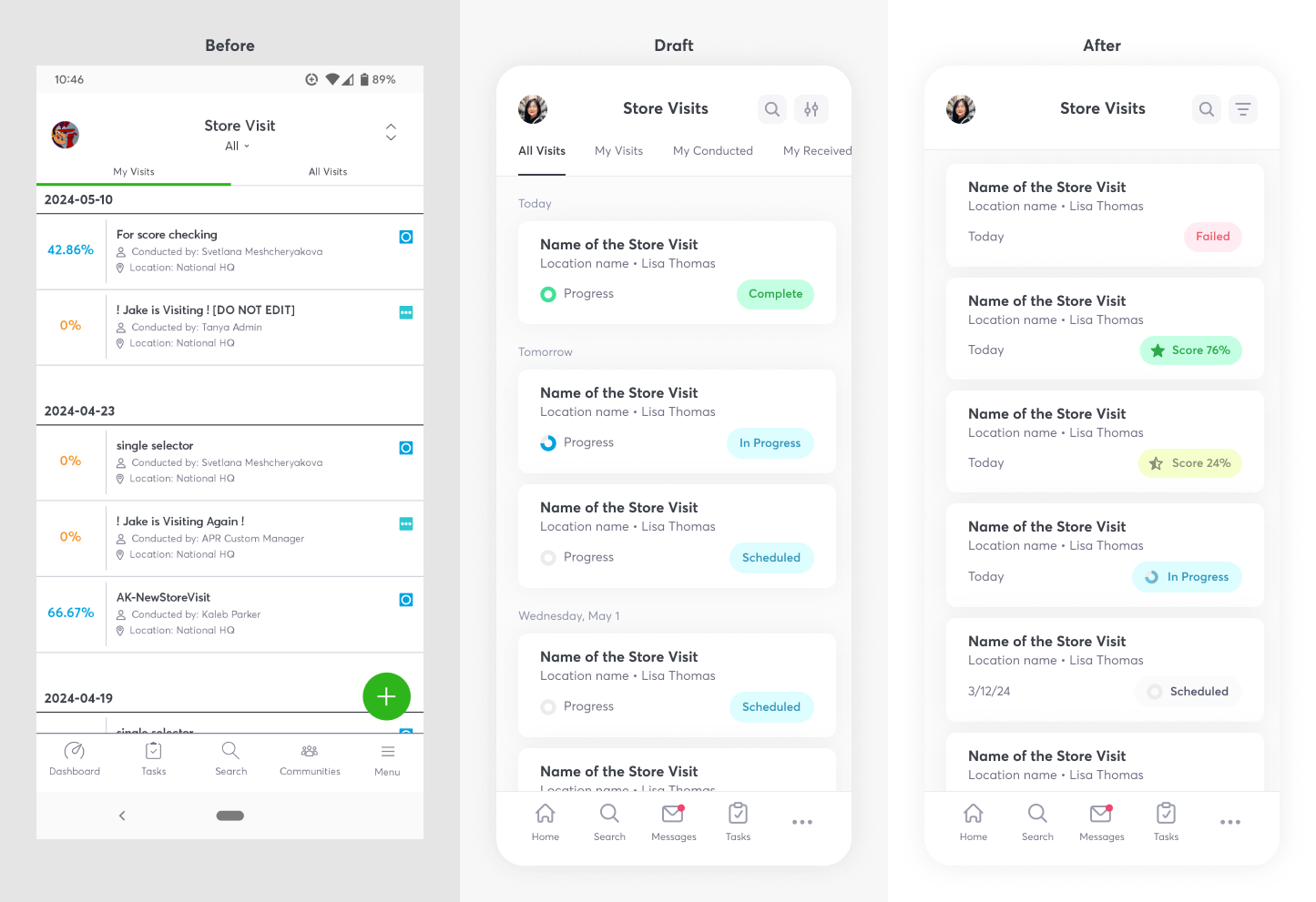
Three Key Design Decisions:
1. Simplified Layouts: We eliminated unnecessary tabs and repositioned date elements within cards, improving event sorting, filtering, and overall clarity.
2. Smarter State Indicators: By removing redundant "completed" labels and surfacing store visit scores post-completion, we created a more intuitive and decluttered experience.
3. Integrated Progress Indicators: We merged progress visuals into status chips and used a star icon to represent scores, reducing visual noise while preserving clarity.
These changes prioritized immediate user value while building scalable, future-ready components aligned with modern enterprise UI standards.
Designing with reusable components that work across multiple pages ensures consistency, efficiency, scalability, and easier maintenance, fostering collaboration and flexibility in the design process.
It is also important for making the app feel cohesive.
The biggest constraint was development capacity. With a small dev team, we had to be extremely strategic about what made it into each release. Backend-heavy features were sometimes postponed to prioritize front-end improvements with higher impact and lower technical lift.
The redesign received overwhelmingly positive internal and client feedback, especially around the visual improvements and UX clarity. Many of the changes addressed long-standing user requests and helped drive business value for retail clients. The redesigned modules now offer a cleaner, more intuitive experience across multiple user roles.
This project taught me the importance of being thorough and detail-oriented, especially when working across multiple complex modules. I also learned how essential it is to prioritize smart, high-value decisions when full-scale redesigns aren’t immediately possible. In hindsight, I would’ve done more to maintain and update our component library to help developers move faster and avoid misalignment.
.png)
.png)
ThinkTime empowers retailers with intuitive task and communication tools designed to enhance performance across every store and engage every team member.
Retail
Industry
2024
Project Year
Project Software
Figma
Objective
Identify user needs and pain points in the mobile app to create a more professional, up-to-date experience for end users.
Goals
1. Modernize the UI: Enhance the StoreForce application by updating the UI to boost user engagement and enjoyment. Replace outdated UX patterns and streamline the information hierarchy
2. Implement Consistent Design Patterns: Establish and apply consistent design patterns and themes across the application for a cohesive user experience
3. Improve Accessibility and Usability: Ensure accessibility compliance standards are met and enhance the overall usability to build user confidence when navigating the StoreForce application
Role
As the UX designer on this project, I worked closely with product owners and the manager to redesign our app and develop new features throughout our sprints.
Performed client interviews, a card sort activity and client surveys to better understand user pain points and opportunities for improvements.
Limited Mobile Functionality
Users expect more features from the web app to be available on tablets and mobile devices, enabling them to perform tasks on the go
Data Visualization
The app feels cramped on mobile devices, making navigation difficult and overwhelming for users due to the small screen size
Navigation & Information Hierarchy:
Users struggle with navigating the app and understanding next steps. They often need support, as many actions are unclear or hidden. This results in a preference for desktop use, where they were trained
Our design process was very iterative and collaborative. Working closely with our product owners and product director for feedback and insight during our design sessions. We brainstormed, identified common use cases, and the most ideal layout of information.
Key Design Decisions:
1. Simplification: By eliminating tabs and relocating the date within the card, we enhanced sorting and filtering capabilities for events.
2. Event states: Recognizing that a "completed" state doesn't require explicit display, we opted for a cleaner UI. The store visit score now appears upon completion, intuitively indicating task fulfillment.
3. Progress Indicator Optimization: To streamline and reduce redundancy, we integrated the progress indicator into the status chip, and differentiated the score with a star instead.
Designing with reusable components that work across multiple pages ensures consistency, efficiency, scalability, and easier maintenance, fostering collaboration and flexibility in the design process.
It is also important for making the app feel cohesive.
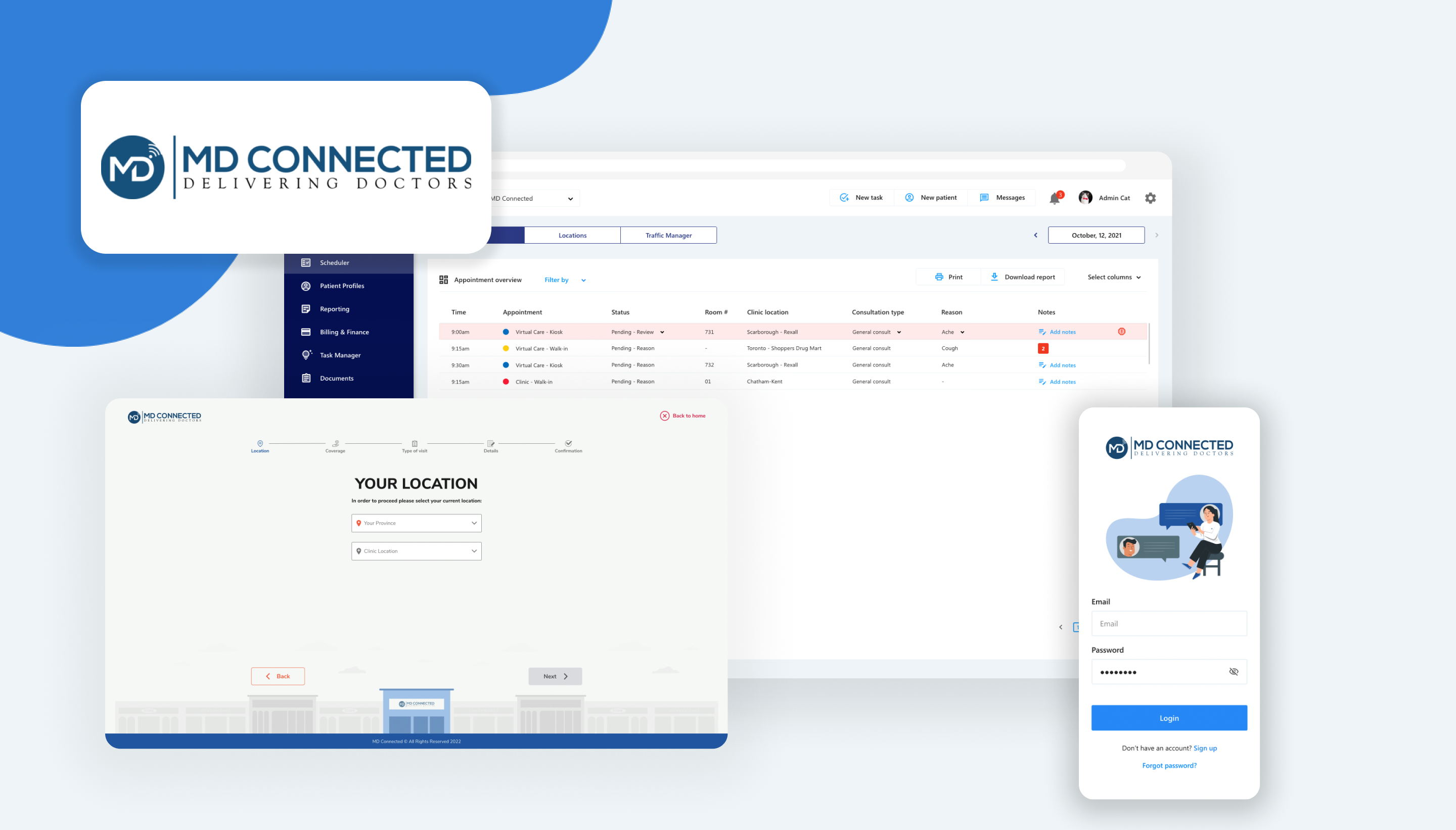
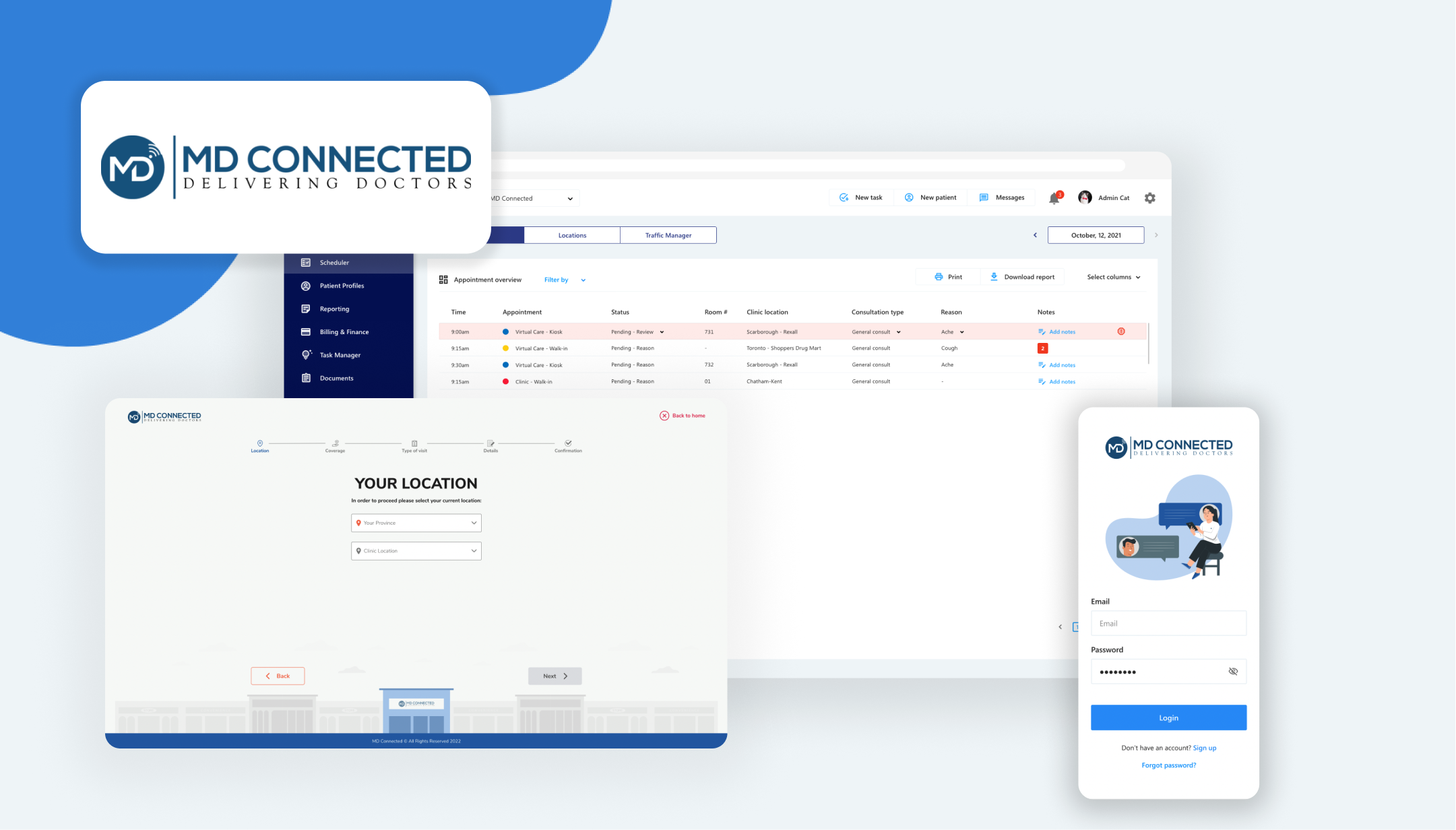
MD Connected is revolutionizing medical care accessibility for Canadians by facilitating virtual connections between patients and healthcare providers.
Health
Industry
2023
Project Year
Adobe XD
Project Software
Objective
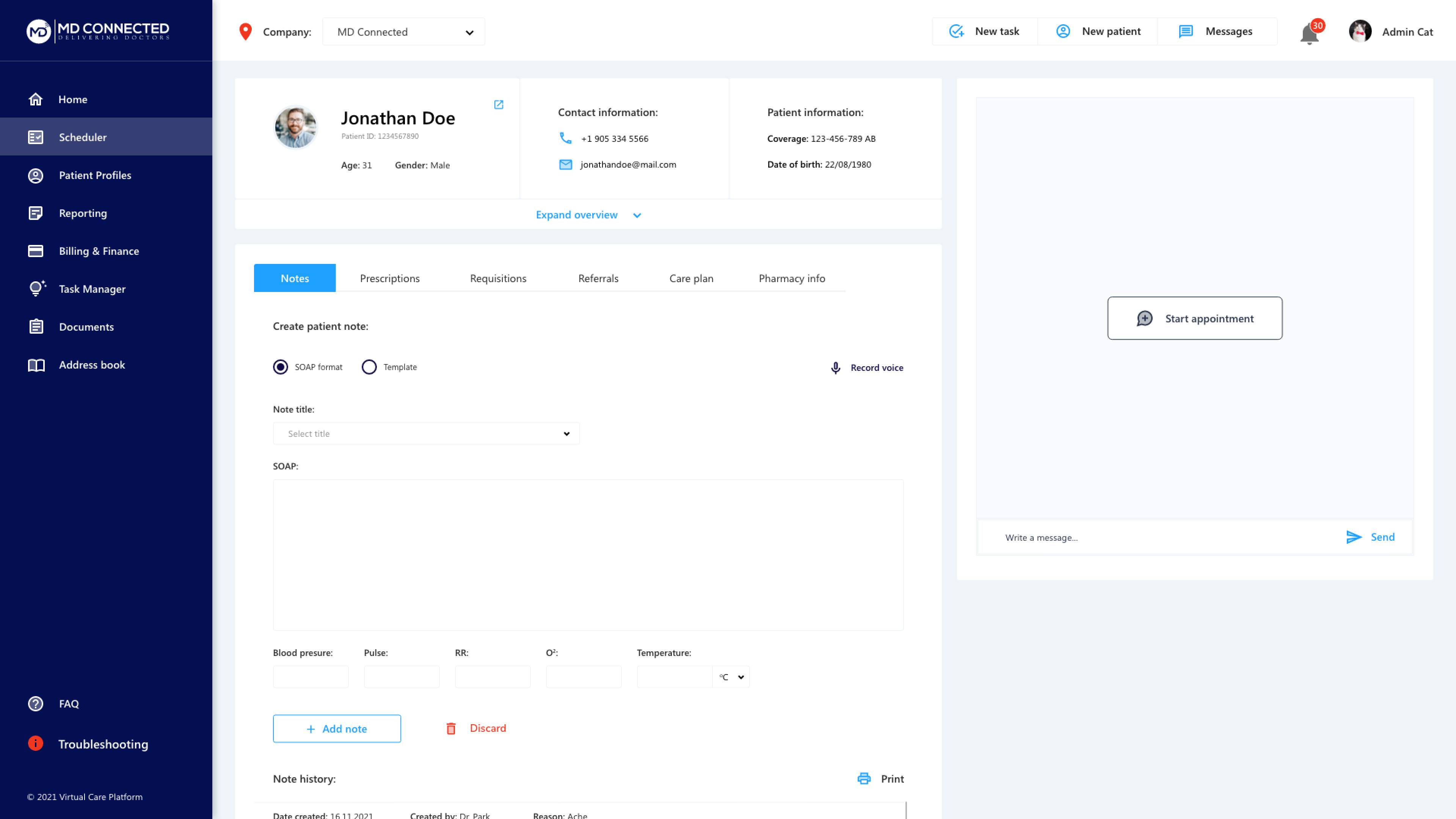
Our primary objective was to create a seamless and more efficient patient-physician experience. By designing our own healthcare platform, we tailored solutions to address our company's specific challenges.
Goals
1. Optimize workflows: Identify and resolve points of user friction to streamline the tracking and documentation process
2. Improve satisfaction: Empower patients to take a more active role in managing their healthcare, thereby boosting their confidence and engagement. Simultaneously, improve the user experience for healthcare practitioners, ensuring they can navigate the platform with ease and confidence.
3. Leverage Potential for Rapid Development: Harness the capability for rapid development to quickly implement improvements and new features, ensuring the platform remains innovative and responsive to user needs.
Role
As the lead UX designer for this project, I worked closely with our lead developer and CEO to address design challenges and propose effective solutions. Additionally, I contributed to project management efforts to ensure a clear understanding of deadlines and milestones.
To gain a comprehensive understanding of Electronic Health Records (EHRs) and the project's scope, we conducted a competitive analysis. This revealed a highly saturated market with hundreds of EHR options, but with many HIPAA and PHIPPA compliance regulations.
There were 5 standout EHR solutions we identified for more in-depth examination: Accuro, Telus Health, OnCall Health, Arya Health, and Athena Health. These were selected for their market prominence and potential to provide valuable insights for our project.

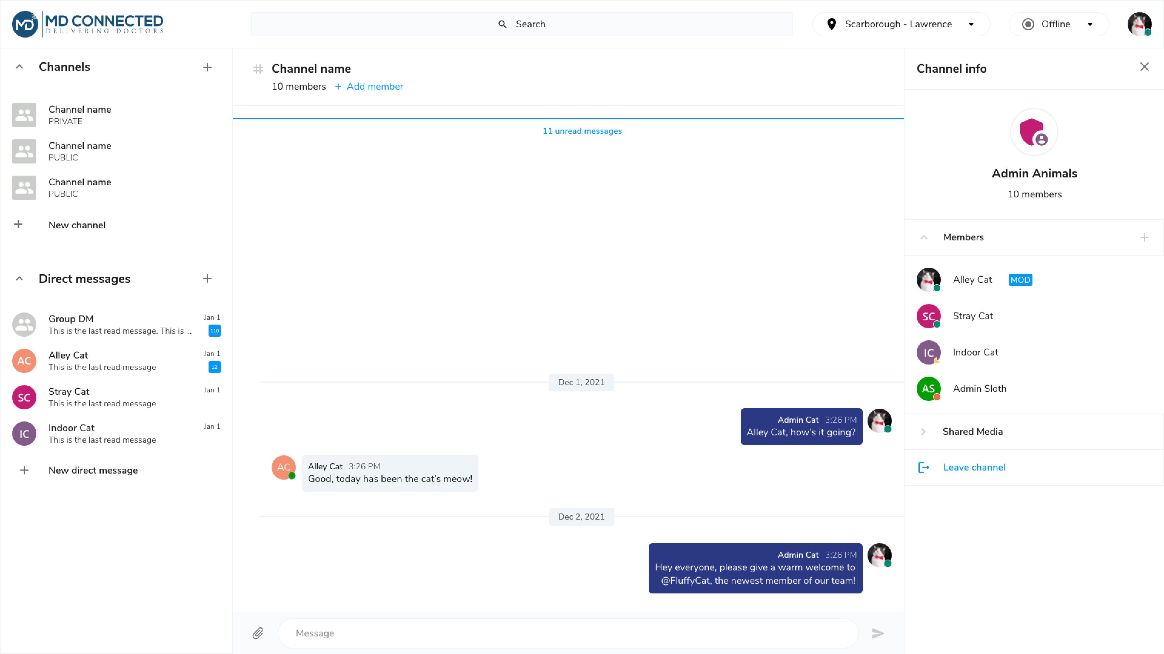
Robust communication systems
Nearly all EHRs featured robust communication systems, including instant messaging, email integration, automated reminders, and phone/video capabilities, enabling seamless interaction between patients and staff.
Outdated UI and navigation issues
Many EHRs struggled with outdated UIs and cumbersome navigation, hindering workflow efficiency. However, some stood out by offering intuitive patient flow and visual aids that clearly indicated progression within processes, improved usability and reduced complexity

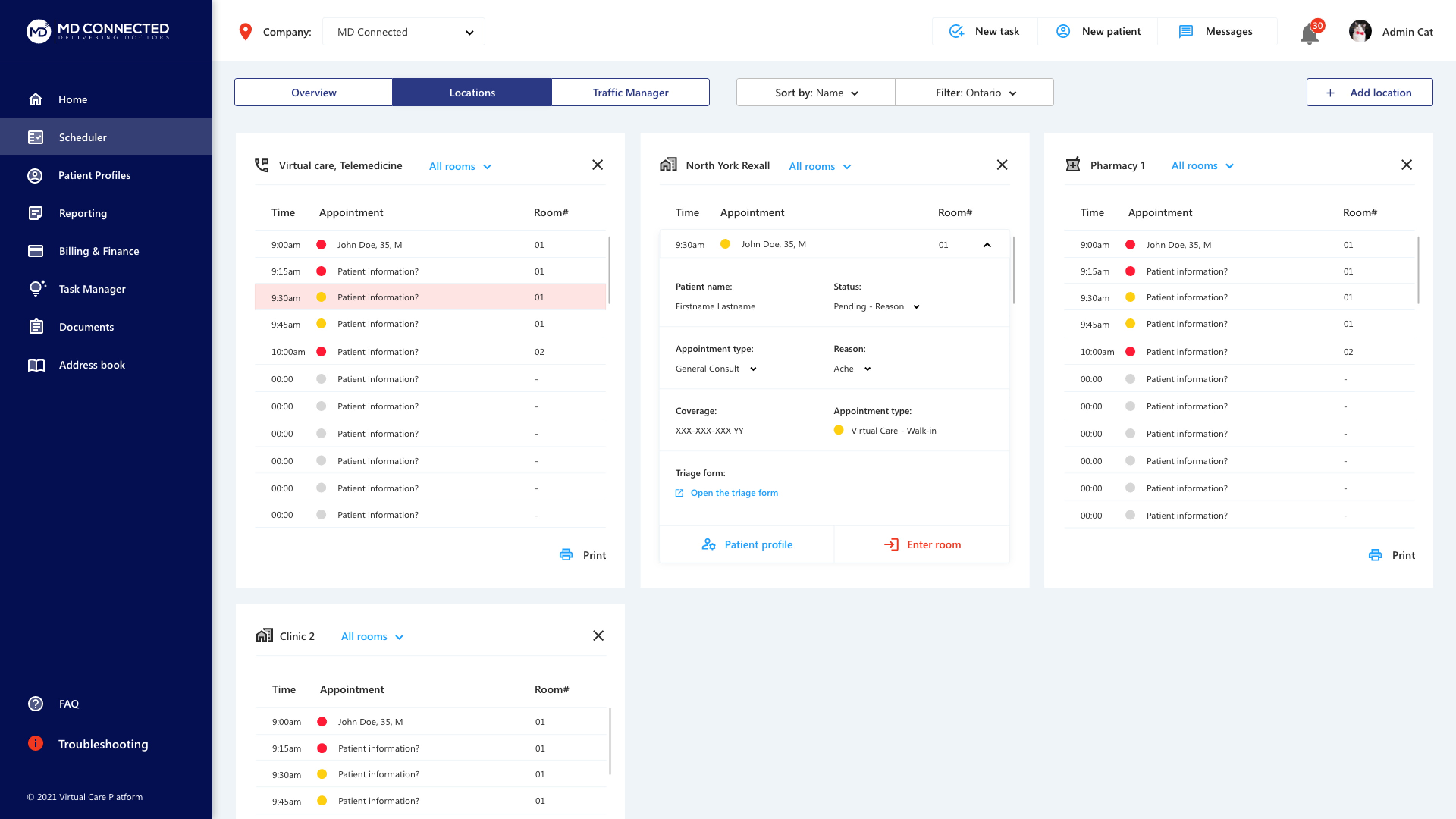
The importance of a traffic manager
Most EHRs lack a comprehensive traffic manager feature, crucial for administrative tasks. This tool allows administrators to monitor patient progress and efficiently move them to the next stage. Its absence represents a significant opportunity to improve administrative oversight and streamline patient management.

Our design process was very iterative and collaborative. Working closely with our product owners and product director for feedback and insight during our design sessions. We brainstormed, identified common use cases, and the most ideal layout of information.
Key Insights:
1. Desire for split screen view of patient records and video consult: Physicians need access to patient records, encounter notes and video capabilities on a single screen, to optimize time management and enhance care quality.
2. Prolonged wait times: Patients experience prolonged wait times and seek greater engagement in their healthcare journey. Implementing solutions to reduce wait times and empower patients is crucial for enhancing satisfaction.
3. Communication work-arounds: Various communication tools, including Google Meet, Zoom, Slack, Teams, etc., are widely used for patient-staff interactions and scheduling. Integrating these tools seamlessly into the EHR system can enhance efficiency and patient experience.
To maintain competitive in the crowded EHR market, we strategically pursued HIPAA and PHIPA compliance. We organized compliance requirements into an Excel spreadsheet and collaborated with the team to assess our progress.
Upon review, we found adjustments to timelines were necessary. We prioritized requirements based on impact to medical practitioners and patients to ensure we were delivering the most valuable features first.

Amid shifting deadlines, we recognized the need for a more robust project management solution to effectively assess project scope and understand feasible timeframes.
As a result, we implemented Asana to convert compliance requirements into actionable tasks for the week. Assigning work items to specific stages (planning, designing, developing, and reviewing) enhanced communication and transparency across the team.
We integrated UX research practices, focusing on rapid prototyping to enhance idea communication and accelerate design iterations. This approach minimized early misunderstandings. As I continued platform design, I prioritized the following principles:
1. Reducing clicks: Streamlining task completion by minimizing clicks was crucial to simplify user experience and improve efficiency.
2. Clear process flow: Ensuring a clear process flow and highlighting mandatory fields guided users through seamless appointment scheduling, enhancing user experience.
3. Visual Hierarchy: Implementing clear visual hierarchy to facilitate intuitive navigation, help users locate information and help users complete tasks confidently.


Enhancing design reviews and gathering relevant feedback was crucial to our process. We invited physicians, nurses, and administrator representatives to our design review sessions to provide diverse perspectives. This inclusive approach ensured designs met specific user needs and workflow requirements.
Following the initial design drafts, I presented them to the team for collaborative feedback. Together, we assessed the layout, structure, and user journey. By incorporating their insights, I iterated on the designs to refine the platform, aligning it with user needs. This iterative process ensured continuous improvement and created a user-centric platform optimized for efficiency and usability.
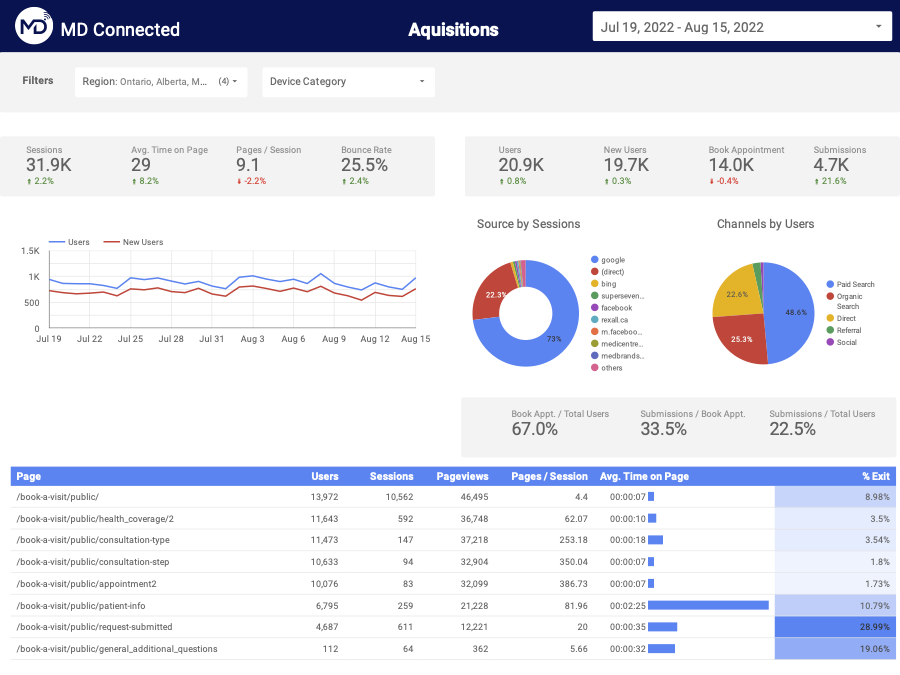
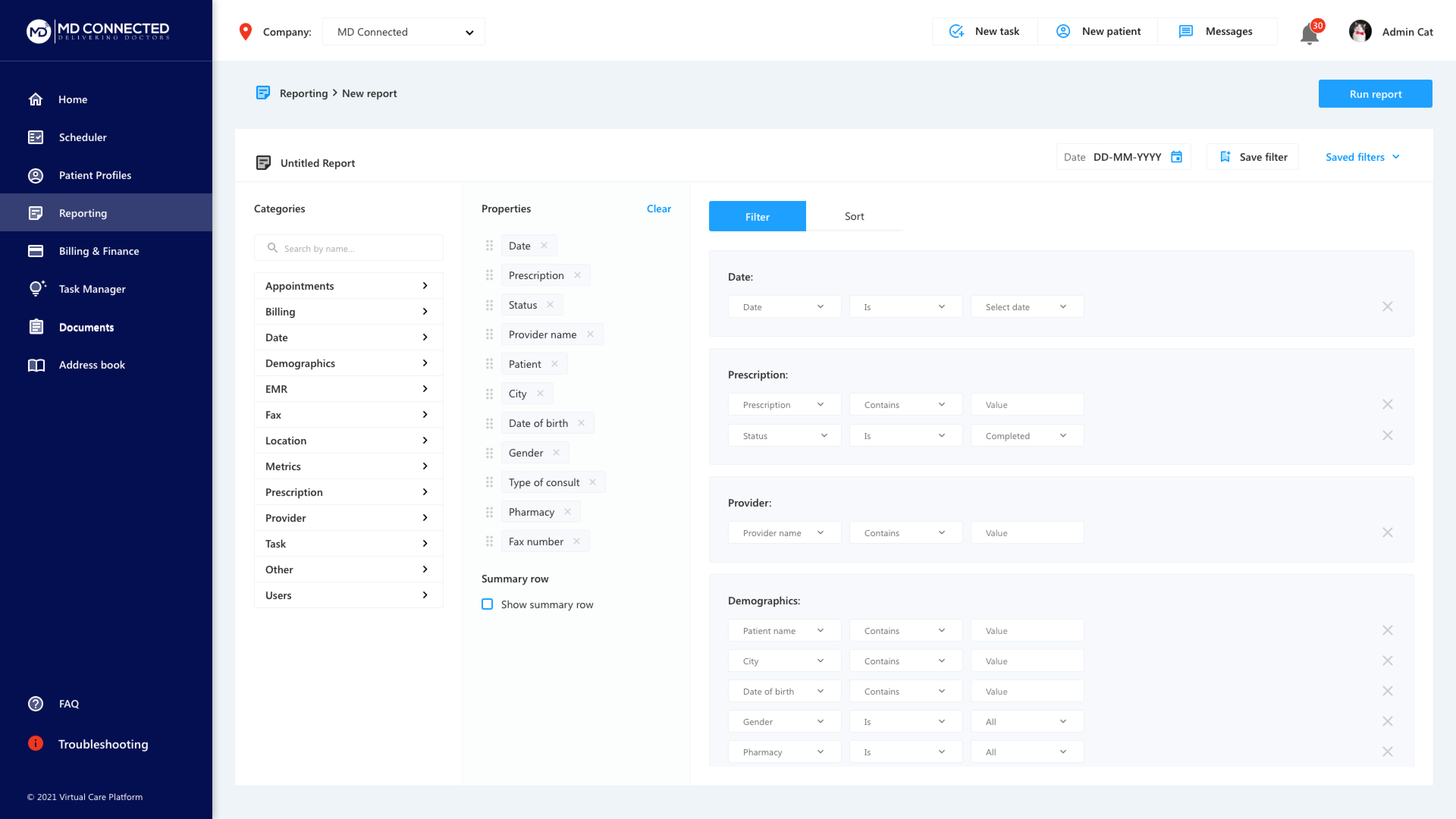
We used Google Analytics and Google Data Studio to delve deeper into user traffic and behaviour, creating a customized report that provided detailed insights beyond standard analytics dashboards.
By leveraging custom metrics and dimensions, I addressed specific questions and requirements not covered by default reports. This tailored approach helped us understand user interactions, engagement patterns, and website performance more effectively.
The Google Data Studio report provided a centralized and user-friendly interface for monitoring key metrics, identifying trends, and making data-driven decisions to optimize our website and enhance the user experience.

We also implemented Lucky Orange alongside Google Analytics. Lucky Orange's session recording allowed us to visually review how users navigate, interact with elements, and encounter issues. This qualitative data complemented quantitative metrics from Google Analytics.
Additionally, heat mapping features from both platforms helped visualize user interactions, highlighting active areas and identifying opportunities for optimization. By analyzing session recordings, heat maps, and analytics data, we gained a holistic understanding of user behaviour. This approach enabled real-time evaluation of product performance, identification of issues during sessions, and assessment of initiatives on user engagement and conversions.
Continuous monitoring and analysis of user behaviour through these tools allowed us to optimize our website proactively, meeting user needs effectively.
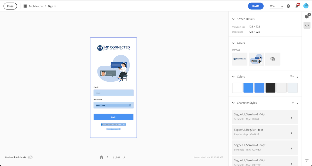
After finalizing design reviews, we shared the prototype link with the front-end development team, granting them access to the HTML and CSS code to begin development. Before any module went live, we conducted thorough reviews to ensure alignment with the approved designs. This involved comparing the developed modules to the prototypes to verify that all visual elements, interactions, and functionalities were accurately implemented.
Any discrepancies identified were promptly addressed through close collaboration with the development team. This iterative approach ensured the final product closely matched the intended design and met stakeholder expectations. By maintaining seamless collaboration and conducting rigorous reviews, we successfully implemented the design vision with quality and consistency.


We successfully conducted a soft launch of our customized EHR within our revised timeframe. The response has been overwhelmingly positive, with users praising the simplicity of the user journey and anticipated efficiency improvements for patient consultations. Looking ahead, we will gather more feedback from end-users before further development, ensuring that user input continually refines and enhances the experience.
1. Developing a Strategic Plan: Lack of project management can delay deadlines. Creating a strategic plan with key milestones, tasks, and deadlines for an MVP is crucial. Proper planning helps manage out-of-scope requests and ensures high-quality delivery. Implementing project management tools and methodologies enhances communication and collaboration, boosting overall efficiency and productivity.
2. Involving Stakeholders Upfront: Engaging stakeholders early sets expectations, minimizes rework, and fosters collaboration. Early involvement gathers valuable insights, aligns objectives, and identifies challenges. This approach smooths design reviews and ensures our solutions are feasible and impactful.
3. Implementing a Design Process: A structured design process ensures consistency, efficiency, and adherence to deadlines. Clear workflows, roles, and responsibilities help manage tasks and resources effectively. A defined design process allows for realistic deadlines, task prioritization, and advance planning. Incorporating feedback loops and checkpoints enables continuous improvement of our design solutions.


CIBC Live Labs is the innovation and digital technology lab of CIBC. Parents were interested in teaching their children how to save and spend money in the digital landscape. Our goal was to create a shared banking experience between the parent and child, where the parent can monitor and control banking interactions and the child can experience more financial freedom (as they age) without distractors.
Retail
Banking
2019
Project Year
Sketch
Project Software
Objective
The discovery process was centered around the idea of a shared banking experience between parents and children, balancing parental oversight with children's desire for financial independence. The goal was to design a connected banking app for clients under 18, allowing parents to monitor and control banking interactions while children gradually gain financial autonomy as they age.
Goals
1. Identify High-Value Features: Determine features that provide significant value to both parents and youths, enhancing the user experience and meeting key needs and preferences.
2. Craft an Intuitive and Engaging Experience: Develop a user experience that is clear, easy to navigate, and engaging, encouraging active participation and ongoing engagement from both parents and youths.
3. Balance Parental Oversight with Youth Autonomy: Create customizable parental controls that allow parents to monitor and manage financial activities while enabling youths to gradually gain financial independence and responsibility, fostering trust and confidence in their financial decision-making.
Role
As a member of the UX research team, I collaborated with project managers, designers, business analysts, and technology experts to conduct a project discovery. My responsibilities included reviewing Mini Discovery and Generative Pre-work, assisting in workshops, brainstorming and organizing user interview questions, noting feedback, and preparing summarized findings.
The discovery phase aimed to gather insights into the digital banking behaviours of parents and children, guiding the design of a user-centric banking app that fosters financial literacy, empowerment, and trust.
Goals:
1. Understanding Parental Concerns and Needs: Exploring parents' attitudes towards digital banking for their children, focusing on security, oversight, and financial education. This involved interviews and surveys to gather insights into parental preferences and pain points.
2. Assessing Youth Financial Habits and Preferences: Investigating children's digital banking habits and attitudes towards financial independence through age-appropriate interviews, surveys, and observations.
3. Exploring Existing Banking Practices: Analyzing current banking apps and services for children and families to identify strengths, weaknesses, and opportunities for improvement through competitive analysis and benchmarking.
4. Identifying Design Opportunities: Synthesizing research findings to identify design opportunities for the app, involving brainstorming sessions and ideation workshops to generate innovative features and functionalities.
Type
Participants
Canadian Banking Clients (10), Parents (5), Youths (15)
Themes Explored

Parent:
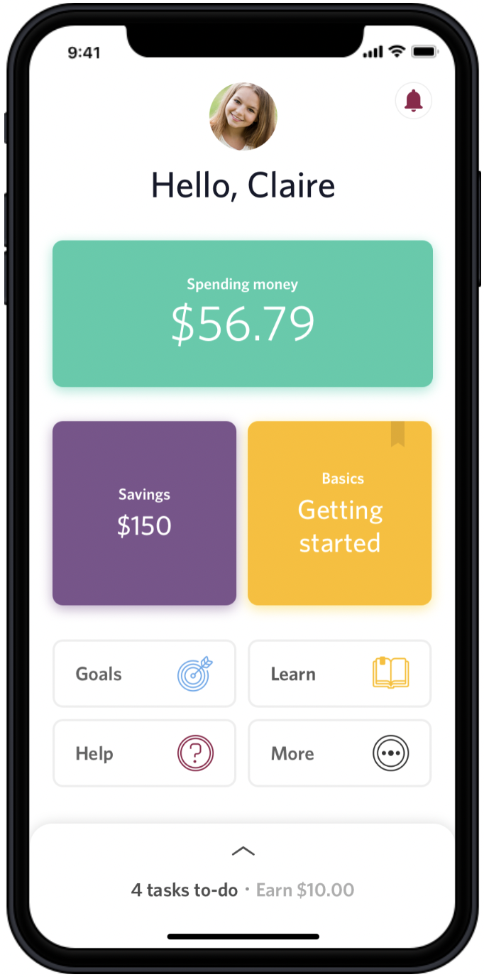
Karen is a 40 year old working professional who deposits various amounts of money into her child's bank account when it comes to mind. They have been giving their daughter, Claire, an allowance in cash and would like to make more use of the bank account she already has in order to start teaching her more about spending/saving responsibly.
Child:
Claire is a 12 year old student who is receiving her "age in allowance" ($12/week) in cash but sometimes her mom forgets. She has saved up quite a bit of cash over the years and has been looking forward to purchasing the new Nintendo Switch. Claire feels ready to start managing her own money.

Testing Results
Users had positive perceptions of the shared onboarding experience. Parents felt it encouraged healthy money habits, and youth enjoyed the simple UI.

Life stages
Several key life stages prompt youth to open their own bank accounts, including: Receiving large cash gifts (holiday/birthday money), entering high school and wanting to pay for lunch/personal shopping, getting their first paycheck, saving for higher education, seeking financial independence from parents.
Youth expressed a strong desire to learn money management skills, especially for future needs like saving for school. Many youth currently save money towards goals, and some feel they need permission from their parents for larger purchases.

Positive Feedback on Shared Experience
Parents appreciated the ability to guide their children through the app, believing it would encourage constructive money behaviors. Youth were comfortable with parental assistance. The shared onboarding experience was successful, but most parents preferred setting up the app in person rather than sending a link.

Customization and Personalization
Youth responded well to tools and functions tailored to their needs (e.g., savings goals, removal of credit score). However, younger participants found some vocabulary and labeling difficult to understand, prompting offline conversations with parents about spending and saving.
Parents and youth expressed appreciation for the shared banking experience, noting its adaptability to their respective life stages. However, further investigation is required to ensure functions will resonate with a larger audience.
1. Financial Management Education: Deepen understanding of offline money education conversations within diverse family dynamics. Research effective digital mediums (e.g., articles, videos) for optimizing financial education.
2. Language and Naming Conventions: Develop strategies to simplify complex financial terminology into age-appropriate language. Identify terminology that resonates with diverse families (e.g., "allowance" vs. "pocket money").
3. Needs and Behaviours: Explore evolving financial needs, preferences, and practices among youth. Understand how youth receive and manage money to support diverse behaviours. Investigate the prioritization and depth of banking controls as youth age.
4. User Interface and Theming: Study the impact of colour on youth user experience, especially as they transition to adulthood. Explore older teens' preferences for interfaces tailored to adults.
1. Stay Agile in Fast-Paced Discoveries: Be ready to adapt quickly to changing priorities and evolving research needs. Keep communication channels open and proactively address challenges to maintain momentum.
2. Engage Stakeholders Early and Often: Involve stakeholders from the beginning and throughout the discovery process. Early and ongoing collaboration increases their investment and support for the project's findings and initiatives.
3. Embrace the Power of Storytelling: Use compelling narratives to convey research findings effectively. By turning data into relatable and impactful stories, you can inspire action and drive meaningful change.

The prototype received overwhelmingly positive feedback from both parents and youth. Designers quickly iterated and integrated user feedback, aligning the design with user needs and preferences. Our product strategy, grounded in robust research insights, provided a strong foundation for decision-making and innovation. The final report serves as a comprehensive guide for future iterations and enhancements, ensuring the project's long-term success.
Our dedication to thorough research was widely acknowledged, highlighting the substantial data gathered during this sprint. This recognition underscores our commitment to excellence and the importance of user-centricity in our approach.
In addition to regular duties, we were grouped and tasked with researching, designing, and pitching a solution to CIBC Digital executives. Our team was assigned to the Client Focus group. We dedicated 1-2 meetings per week in our spare time to collaborate on this project.
Retail
Banking
2019
Project Year
Sketch
Project Software
Objective
The discovery process was centered around the idea of a shared banking experience between parents and children, balancing parental oversight with children's desire for financial independence. The goal was to design a connected banking app for clients under 18, allowing parents to monitor and control banking interactions while children gradually gain financial autonomy as they age.
Goals
1. Identify High-Value Features: Determine features that provide significant value to both parents and youths, enhancing the user experience and meeting key needs and preferences.
2. Craft an Intuitive and Engaging Experience: Develop a user experience that is clear, easy to navigate, and engaging, encouraging active participation and ongoing engagement from both parents and youths.
3. Balance Parental Oversight with Youth Autonomy: Create customizable parental controls that allow parents to monitor and manage financial activities while enabling youths to gradually gain financial independence and responsibility, fostering trust and confidence in their financial decision-making.
Role
As a member of the UX research team, I collaborated with project managers, designers, business analysts, and technology experts to conduct a project discovery. My responsibilities included reviewing Mini Discovery and Generative Pre-work, assisting in workshops, brainstorming and organizing user interview questions, noting feedback, and preparing summarized findings.
In order to understand the ask, we defined transactional channels and relationship channels.
Transactional: A detached experience out of necessity, designed to be quick and end shortly with a emphasis on sales.
Relationship: A personalized, meaningful, connected experience where you feel your needs are cared for and met.
We then decided to do a dive into how clients currently perceived our products. We found that clients not only desired a personalized experience, but expected one already. Furthermore, we validated that creating a more relationship based banking experience in the digital landscape would in fact positively impact the company. Quotations were derived from our mobile banking app reviews, recorded interviews and online posts.
.008.jpeg)
Patricia is a young adult who enjoys going out 3-4 times a week. She wants to feel in control of her finances and learn more about what she can do with her money. She prefers mobile banking and never goes to a branch. She has a no-fee chequing account but minimal savings and no investments. She wants to save for an upcoming vacation
INSIGHT #1: Clients expect a personalized experience and will abandon if lacking.70% of clients expect specialized treatment for being a good customer: "If there was an option [to] customize this to personal preference that would be fantastic".
30% of clients abandon business relationship because personalization is lacking: "I liked having a little welcome message and the photo I selected, made the app feel it's about the customer. Now all your information is shoved to the bottom and makes you feel less important than the advertisements!"
"One of the reasons why I don't think I used online banking in high school is because I just had no idea how to work it...There were multiple tabs that never applied to me."
INSIGHT #2: Proof of Simplii's transactional state (Adobe Analytics)Visit every 2 days3-minute interactionsFixed set of resources availableTop 3 actions: review transaction history, send an Interac e-transfer, pay a bill
INSIGHT #3: Driving emotion creates a less generic banking experience and has a bigger impact on brand loyalty"Most banks digital experiences are generic and fail to generate positive emotion." -- Forrester, 2019"Emotion has a bigger impact on brand loyalty than effectiveness or ease"In order to drive emotion, we can inform to help the client learn, guide to simplify the client's banking experience, advise and care.
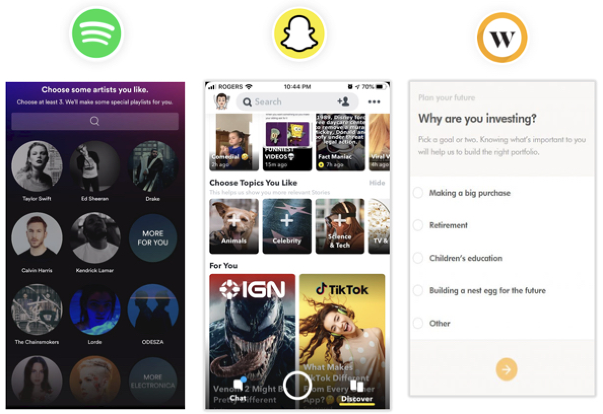
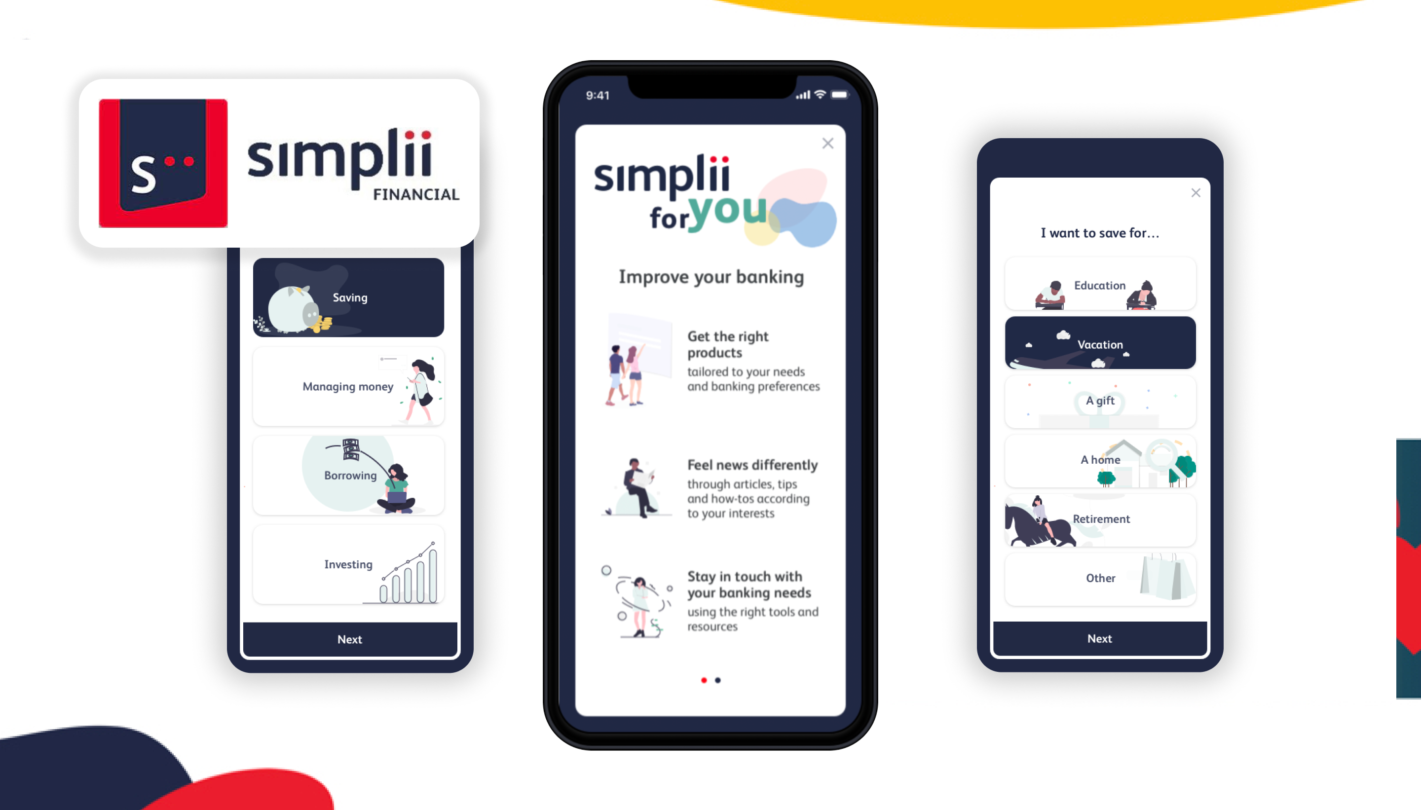
After researching different ways to achieve personalization, we realized that many popular and leading applications made use of a 'For You' page; a set of recommended products based on a survey. Furthermore, none of Canada's mobile banking apps featured anything alike, with the exception of Wealth Simple. We felt this could be a big missed opportunity and that this was a solution that could be further explored.
We pitched our proposal to senior executives at CIBC Digital with the expected benefits of increased sales in product opens, increased engagement with tools and articles, an increased 30-day active and improved CX which could be measured via NPS, app score/reviews and social media commentary.
Some takeaways include:
1. Don't lose sight of the problem when designing for the solution: Our team went through multiple different solutions only to realize that they were either already in the works, or not feasible. Once we returned to the problem and what we were solving for, we quickly settled on an idea that was client-focused and implementable.
2. Be prepared to pivot or scrap design ideas along the way: I think it's safe to say, expect the unexpected. It can be frustrating when things don't work out the first time or even the second time, but eventually the right solution with be discovered.
3.Leaders are there to help: Running ideas by our team lead and other coworkers was so important to grasping whether our solutions were feasible or not. Understanding more about the business and the inner-workings were imperative to discovering a solution that worked well in the system.
Create a personalized, meaningful and connected banking experience for mobile users by understanding the client through surveys.
1. Relevant products, resources and tools will be surfaced based on the information they fill out.
2. Personalized content reduces information overload. Meaningful experiences brings the user to the forefront.
3. Driving connection helps education and empower clients in their financial decisions

Sketching, wireframing, prototyping, design system maintenance, social media, email, video marketing, client data presentation
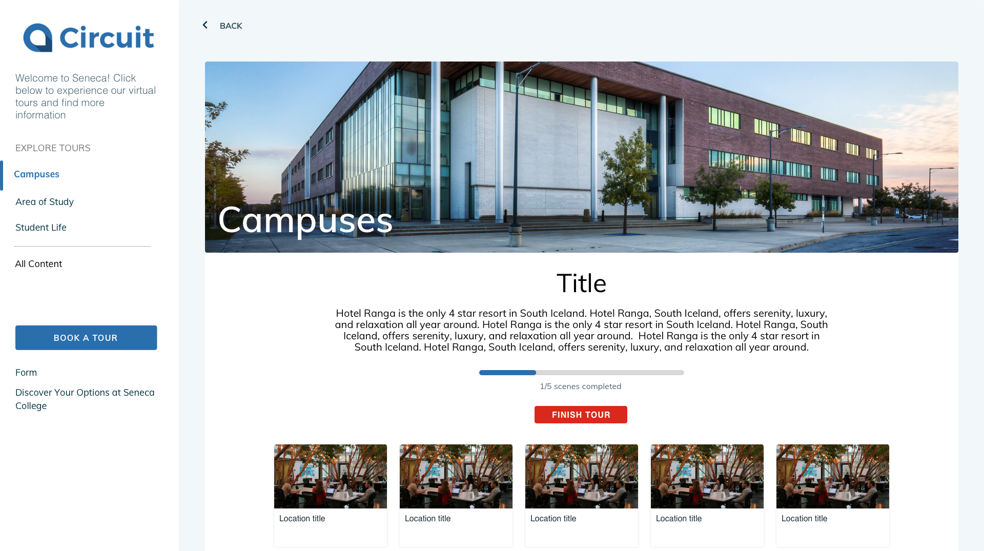
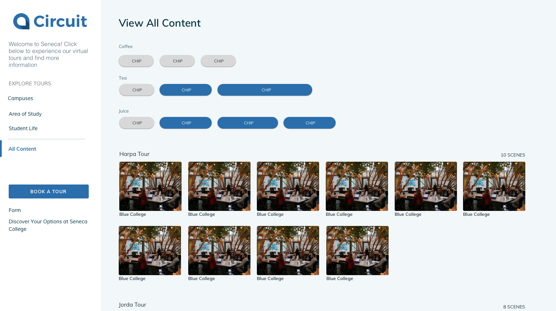
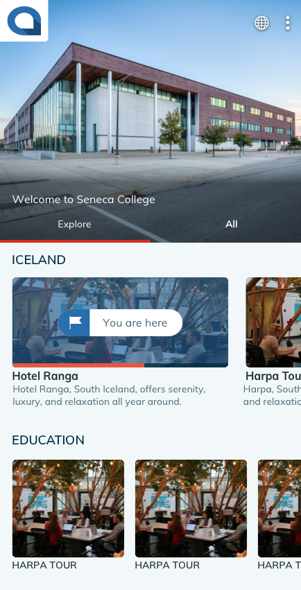
Initially our product simply launched users right into a virtual tour, but we found that clients were creating multiple tours for their institutions which needed to be organized. We needed an intuitive experience for clients to update tour content (using our CMS) that would reflect positively towards visitors who would be navigating through the content provided. Beyond Media was looking to provide an experience that organizes and customizes our client's virtual tours which can be rebranded to reflect their institution.
GOALS:
Identify tags and filters to help clients find and explore desired spaces.Create an experience that is intuitive, simple and easy to use.Responsive design must available for all desktop, tablet and mobile users.
We jumped into prototyping quickly, and because the team was so small, I could iterate right on the spot. After reviewing our options, we chose the most straightforward design, where tours could be organized into different groups (such as campuses, area of study, student life, etc.) We then explored different filtering systems that could be applied and the developers worked out the logic.
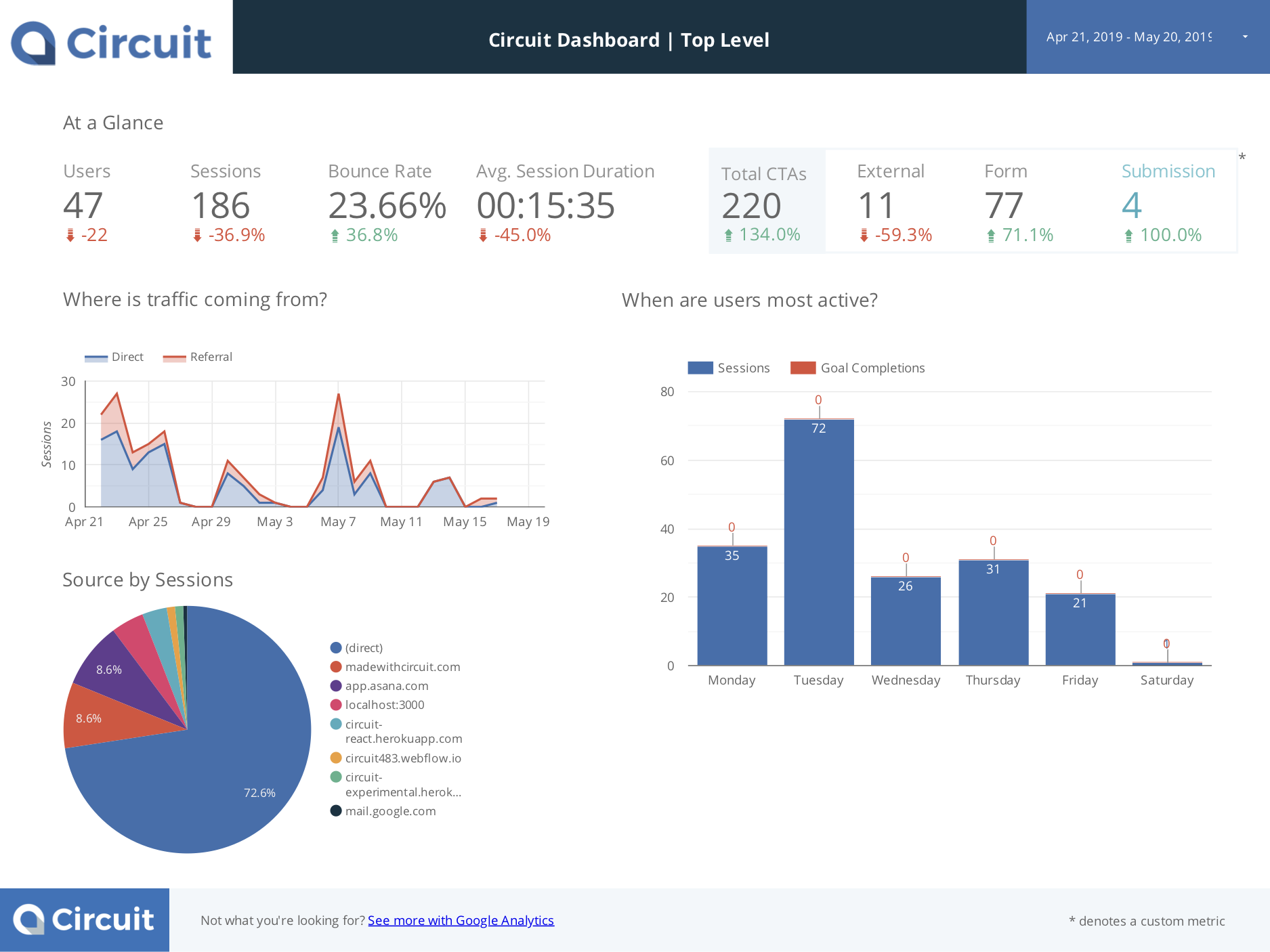
To gain more insight into our product and user experience, I created this report template in Google Data Studio. These intuitive dashboards synced with Google Analytics clearly organize information and useful functions can be used to configure customized widgets, filters, graphs, charts and tables.
This report helped our clients visualize a more refined view of user demographics, user behaviour, referral pages, interactions and any problems we can address (ex. bounce rates, content relevancy).

After learning that video is one of the most engaging ways to market, we decided to create a promotional video highlighting all of our product's features. I created this video with the help of our CEO (in voice over) to help prospective clients learn more about our product and the different features included.
Idea generation is an important step. Come prepared. Without user testing, it can be difficult knowing what the right move it. On the bright side, this isn't the only type of research you can do. Spend some time researching competitors and best practices.
Create a personalized, meaningful and connected banking experience for mobile users by understanding the client through surveys.
1. Relevant products, resources and tools will be surfaced based on the information they fill out.
2. Personalized content reduces information overload. Meaningful experiences brings the user to the forefront.
3. Driving connection helps education and empower clients in their financial decisions